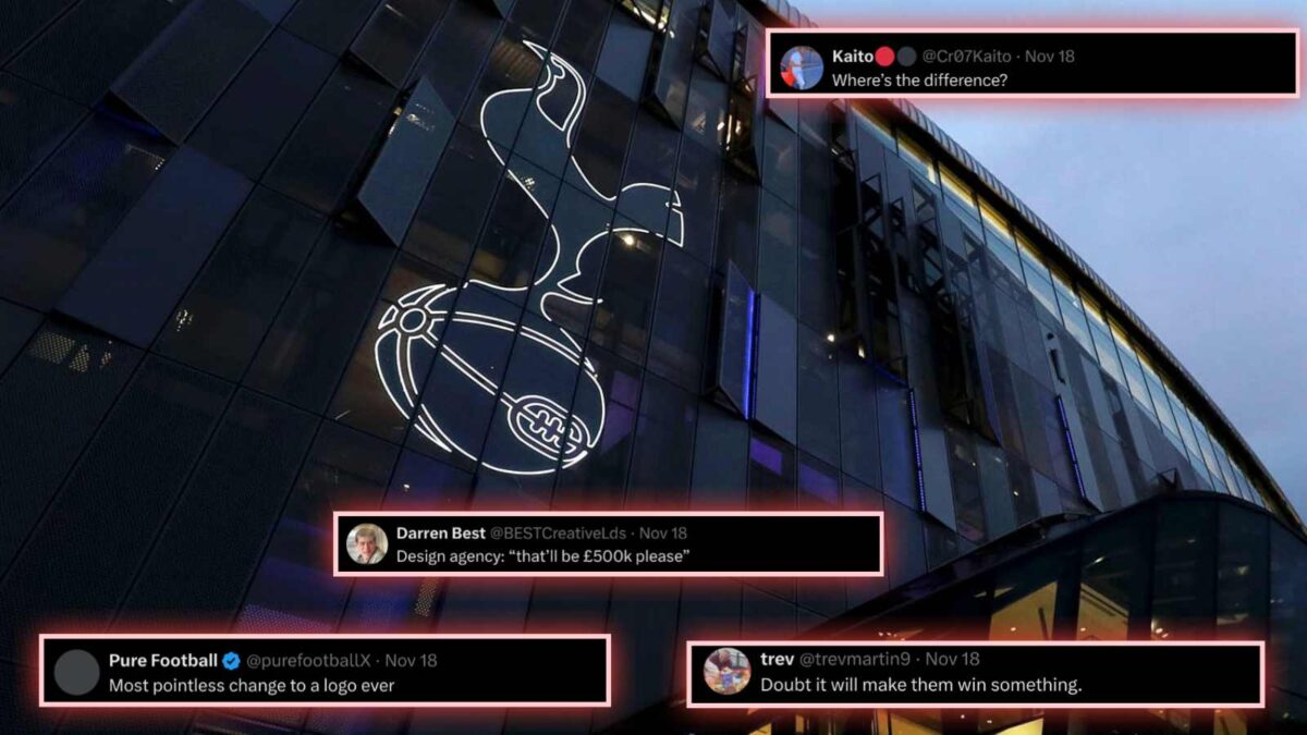
“No name, no trophies” – Fans mock Tottenham Hotspur as club announces ‘pointless’ logo change
Fans made fun of Tottenham Hotspur's newly redesigned logo, deemed it pointless as just the club's name from underneath has been removed.

Tottenham Hotspur recently released their newly redesigned and re-branded logo. (via X)
🔍 Explore this post with:
EPL giants Tottenham Hotspur revealed their re-branded and redesigned club logo and signature font, sparking varied reactions from football fans. The logo has been changed with an ambition to make the club more recognizable, daring as well as playful.
Tottenham’s current logo has a cockerel on top of a football with its details, alongside the club’s name written underneath it. In order to simplify the logo, the club has now eliminated the writing from below the cockerel. In another silhouette version of the logo, the club also blacked out the objects and introduced a modernized font along with a THFC monogram, hoping to create a new visual identity for the future. The new badge is a result of a nine-month long collaboration with branding experts Studio Nomad.
More than 300 people have worked on redesigning the Spurs badge, including players. The Tottenham badge had undergone change in 2006, when the club decided to modernize its image. The old badge and coat of arms was replaced by a professionally designed logo and the club’s name underneath it. Again in 2017, Spurs attempted to change the logo by adding a shield around it. However, they later removed it the following season. The 2024 design has also received mixed reception, with some fans disapproving it.
No name ? No trophies
— Sir Jim Ratcliffe ?⚪️⚫️ (@RatcliffeUtdEra) November 18, 2024
Tottenham’s revamped logo will feature on the player’s shirts in their upcoming Europa League outing against AS Roma. Manager Ange Postecoglou, who remains under pressure after having promised to win a trophy this season, has also backed the new logo design.
Fans criticize Tottenham Hotspur’s new logo design, amid club’s poor Premier League form
Tottenham Hotspur’s recent announcement of a logo modification has not been received positively by fans, as they have labelled it as ‘pointless’. Several fans took to social media to express their confusion over the club’s recent decision, despite their poor EPL form.

One fan hilariously backed the logo change by exclaiming that the name written underneath has been rightly removed due to the club’s lack of trophies. Another fan exclaimed that the club just removed the ‘Tottenham’ out of their name. One fan jokingly stated that the ‘basketball’ from underneath the cockerel had to be removed first. Some fans, however, expressed excitement for the new design.
Most pointless change to a logo ever
— Pure Football (@purefootballX) November 18, 2024
It's a matter of time for this: pic.twitter.com/h0NhIgellV
— 阿莫林最好的朋友?? (@Amorimsbestpal) November 18, 2024
They have just removed the 'Tottenham' out of the club.
— FergiesRightRef (@FergiesRightRef) November 18, 2024
Might be a good thing.
What are they called now? With the name removed, I have no idea ?
— Daniel Smith (@DanUnited78) November 18, 2024
'Cock & Balls FC'? ?
Design agency: “that’ll be £500k please”
— Darren Best (@BESTCreativeLds) November 18, 2024
Where’s the difference?
— Kaito?⚫️ (@Cr07Kaito) November 18, 2024
Why have they kept the basketball in it?
— Chris (@ChrisHa21736755) November 19, 2024
Fans pointed to the fact that nothing had changed in the logo, apart from the words written underneath the objects. They expressed their opinion that it does not qualify as a ‘rebranding’, with no significant change in the design.


