Why Are Olympics and Paralympics’ Logos Different?

Olympic vs Paralympic logo
🔍 Explore this post with:
After witnessing some quite exciting sports at the Tokyo Olympics 2020, it is time to watch some intriguing stuff at the Tokyo Paralympics 2020. The event will begin on August 24, 2021, and will stretch for two weeks till September 5, 2021. Interestingly, fans will be seeing a couple of new sports this year at the Tokyo Paralympics 2020.
Even though the Paralympics are a part of the Olympics Committee, they are a separate entity. Moreover, the Special Olympics also represent a completely separate entity- which is different from the Olympic Games.

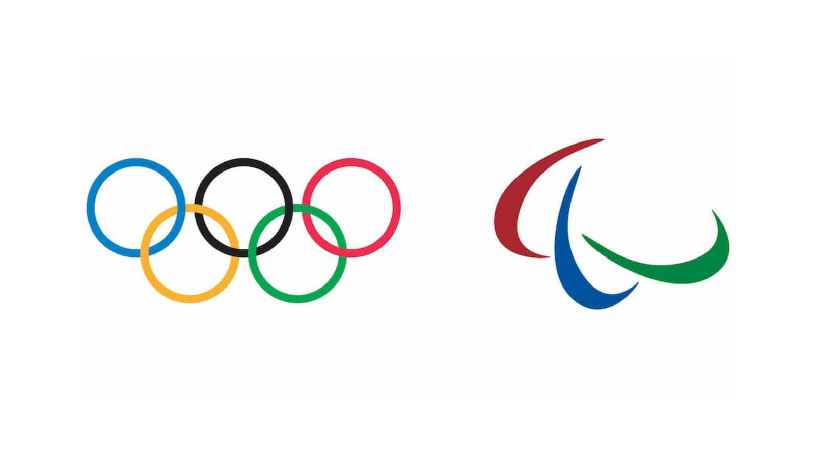
It is because of this reason that the Olympics and the Paralympics don’t have a similar logo. The International Olympic Committee is very particular with its logo and although it provides all the necessary help to support the Paralympics, it is very protective when it comes to its logo.
As a result, the Paralympics have a logo of their own- which is different from the Olympics’ five rings.
All you need to know about the Paralympics Logo
There are three ‘Agitos’ that make the Paralympics logo. ‘Agito’ is a Latin word that mean ‘I move’. The three Agitos are red, blue, and green in colour- that are widely used in the national flags of most of the nations. This symbol was introduced after the 2004 Athens Paralympics 2004.
The three Agitos encircling a central point symbolize motion, emphasize the role of the Paralympic Movement in bringing athletes together from all corners of the world to compete.
The logo clearly reflects the Paralympic Motto, ‘Spirit in Motion’. The logo highlights the fact that Paralympic athletes constantly inspire and excite the world with their performances: always moving forward and never giving up.


